
I like the BBC News website. I found myself interested in the mid 2000’s model (2003-2005). I like the typing out the latest news feature, as well as the three column layout.
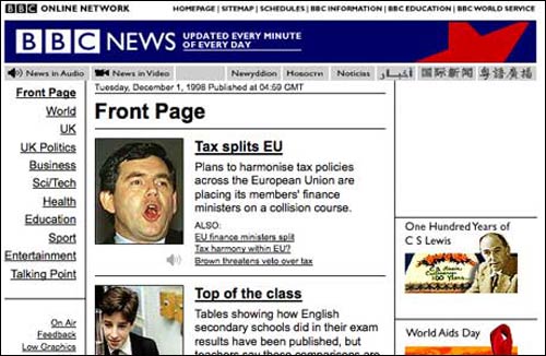 Model from 1997
BBC News launched online in 1997. I did not like the earliest models in the 1990s. But, I did appreciate the simplicity of the layout. My least favourite was the 2000-2002 layout . It was condensed and crowded, plus the layout was word heavy. And the graphics were subpar.
![]() Current 2013 header
Current 2013 header
The navigation of the current BBC News layout is easy to understand. The graphics are clear and detailed. I like how the top news stories are made bigger, so the appeal to click on them is stronger. I also like how the links to news stories in different continents and subjects are neatly lined on top. I’d have to say this is my first favourite out of all the designs. I suspect it heightens in favour because I am used to seeing this layout.
Leave a Comment